Editing model
The Color Buddy has been designed to facilitation the creation of excellent color palettes that meet concrete design guidelines with respect to usability, accessibility and design practice. The best way get an overview of the different editing functions provided by Color Buddy is to use the Tour, which is available from the Help menu (? icon in the upper right corner of black header bar). It identifies the Edit Plane, its associated Controls and Simulations, the Colors Panel, the Top Controls, Examples, Comparison and Evaluation sections of the UX. This document describes how these pieces fit together.
Colors and Palettes
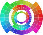
A color is a point in a color space. It has a value, a system assigned name and optional tags. All the colors in a palette are displayed together in the Edit Plane, whose axes are defined by the selected color space. In most cases, the 2D graph displays hue and chroma, lightness is shown on the vertical scale on the right. To edit a color (or colors) select and drag them to position them within the color space. Or, apply the editing controls, which will appear once a color or colors are selected. The simplest specification of a color is a RGB hex value. These are displayed as a list in the Editing controls, which can be copied and edited.
A color palette is an ordered list of colors. It has a name, type and optional tags. Palettes are automatically evaluated using the tests listed in the Evaluation. All the colors in a palette are displayed in the Colors Panel, which lists each color, its name, its hex value and optionally Metrics (distance, contrast) and icons that identify issues identified by the Evaluation guidelines. Color Buddy supports editing a single palette at a time. Any palette created or modified by a user is automatically stored in the Palettes manager.
Comparing Palettes
Comparing different palettes, especially different variations of the same palette, is an import part of palette design. To support comparing palettes, the Palettes Manager offers a thumbnail view of each palette, whose style can be modified to include specific examples as well as a simple set of disks, for more nuanced comparison.
The Comparison view provides a way to see two palettes side-by-side in the same view as used for editing, which is a visualization of the colors in a specified color space. These visualizations illustrate important differences in color relationships within palettes. The most useful comparisons are two different palettes in the same space, or the same palette in two different spaces.
Examples
Visualizing colors in context is critical for effective design. Color Buddy provides three options: Swatches, which include common glyphs used in data graphs; Visualizations, a set of common graph types specified in Vega or Vega-Lite JSON; SVG, a set of illustrations specified in svg (Scalable Vector Graphics) format.
The Visualization and SVG examples can be customized. Each has a pull-down that contains Edit, Delete, Duplicate, Rename. In addition, the Thumbnails pulldown can be used to focus on a single example (or return to All). This menu also contains an Add Example button, as well as Restore Defaults, which returns all the Examples to their original state.
Evaluation
The Evaluation pane manages all the algorithmic tests for compatibility with the design guidelines (lints). There are four categories: Usability, Contrast accessibility, Color accessibility and Design.
The Usability tests ensure that the colors in the palette are distinct from one another. Distinctness is a function of color difference (deltaE values), which varies with the size of the glyph. In addition, there is a test for color name distinctness, which is based on the automatically generated color names. For sequential and diverging palettes, there are tests that the colors appear to be in a sequence.
The Contrast accessibility (WCAG) test for luminance contrast with the background as defined in the current WCAG 2.1 requirements. Contrast is calculated as (L1 + 0.05) / (L2 + 0.05), with luminance defined by assuming the RGB pixel values can be converted to luminance via the sRGB display specification. The requirements are 7:1 (AAA text), 4.5:1 (AA text) and 3:1 (Graphical objects).
To be continued...
